 中文
中文
As the spring festival was just over, many people wanted to re-decorate their homes by this opportunity. The light absolutely adds the finishing touch for the home furnishing space.
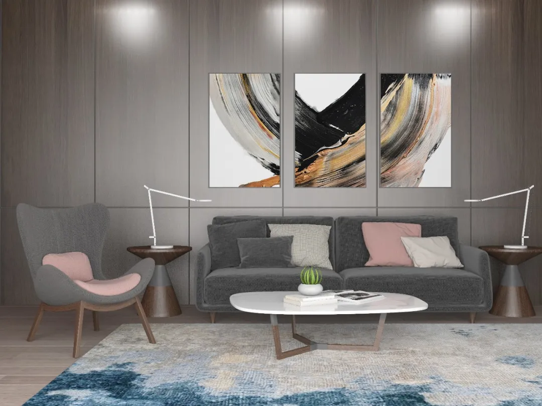
How to select and buy high quality lighting lamps? Want to have good lighting at home?Step 1. Know the good lighting.#Simon Good Lighting · Basics#, bringing you to know the lighting parameter “Four Kings”!
Glare index
As the name implies, glare is a kind of lighting that makes people feel uncomfortable, even dizzy. High brightness within the visual field, or over large light and shade contrast will make eyes uncomfortable. For example, we all had the experience of “being glared to be blind” by the headlights. This is a typical glare phenomenon.

So glare is closely linked to our life. When selecting and buying lighting products, we may focus on the universal glare rating (UGR) of the lighting lamp. Generally, the smaller the figure is, the stronger the anti-glare ability is. When the UGR is less than 16, the lighting environment is basically free of discomfort.
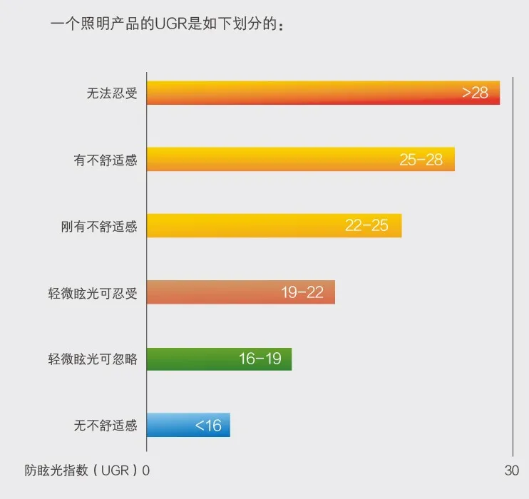
* In 1995, CIE proposed to use UGR as the quantitative index for assessment of uncomfortable glare. UGR computing methodology combines and simplifies the glare computing formula as proposed by CIE and many countries. The subjective feeling of the uncomfortable glare corresponding to its figures is consistent with the UK glare metrics. This methodology is also recognized by other countries in the world.
During the interior finish design, the glare may be improved in the following aspects:
· When selecting and buying lights, we may concern the lights with sub-transparent covers that can weaken the over-concentrated light source and disperse it out, thus effectively reducing glare.
· The grid lights can also cover partial lighting and reduce glare.
· Upon installation of lights, it is required to note the projection direction of the lighting, better being vertical to the direction of the eyes’ general level.
· The desk for reading shall be that made of unreflecting materials, in order to reduce the reflecting glare.
· For lower house height, it is suggested directly using the indirect lighting.
Illumination intensity
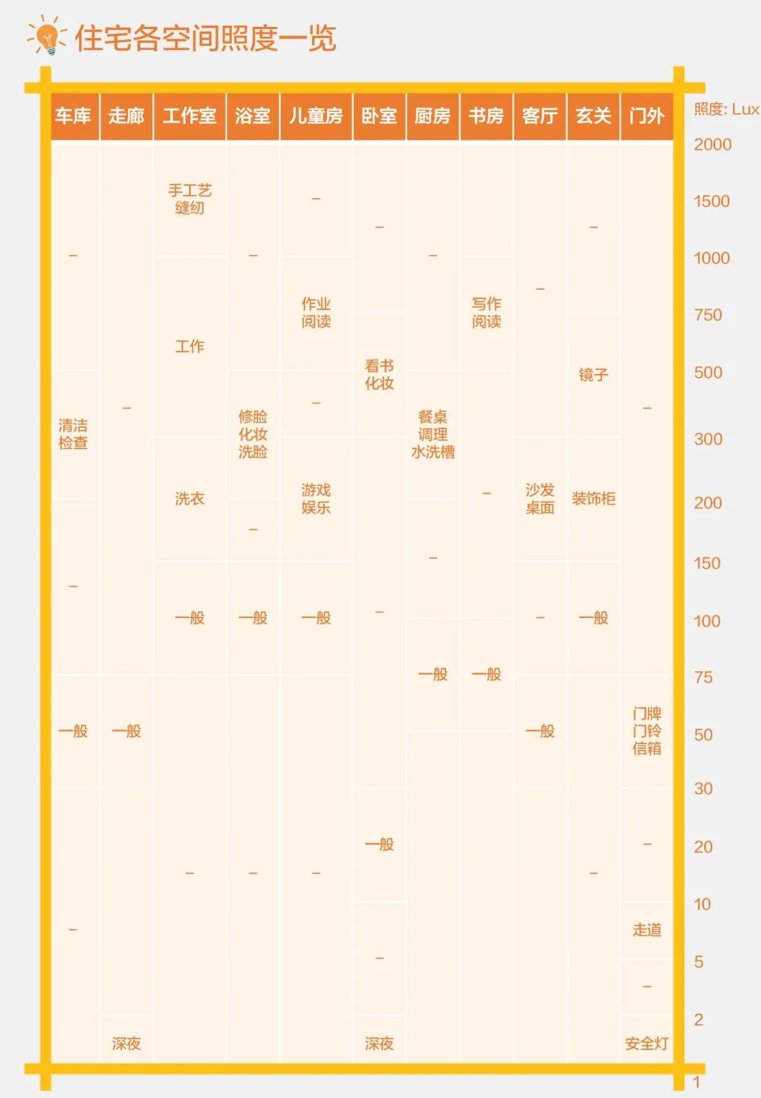
Illumination intensity means the quantity of lumen of the luminous flux on the unit area of the given illumination surface, measured in Lux. As we often say the reading desk is bright enough or not, it generally means whether the illumination intensity is enough or not.In the same given area,the higher the luminous flux of a luminaire is, that is to say, the higher the lumen is, the higher the illumination intensity is.Typically, the bright and clear working environment requires a higher illumination intensity.
Color rendering index
The Color rendering index (Ra/CRI) defines the ability of a light source to identify colors, and is measured on a scale of 1 - 100. The higher the point is, the better the coloration of the light source is.The color rendering index uses different colors, including 14 colors as specified by CIE (International Commission on Illumination). In China, we add the Asian women’s skin color to the palette, so there are total 15 colors. They are marked as R1, R2, R3......R14, and R15.Ra means color rendering index (i.e. mean of R1~R8, R9 and those after R9 stand for those special color rendering indices).
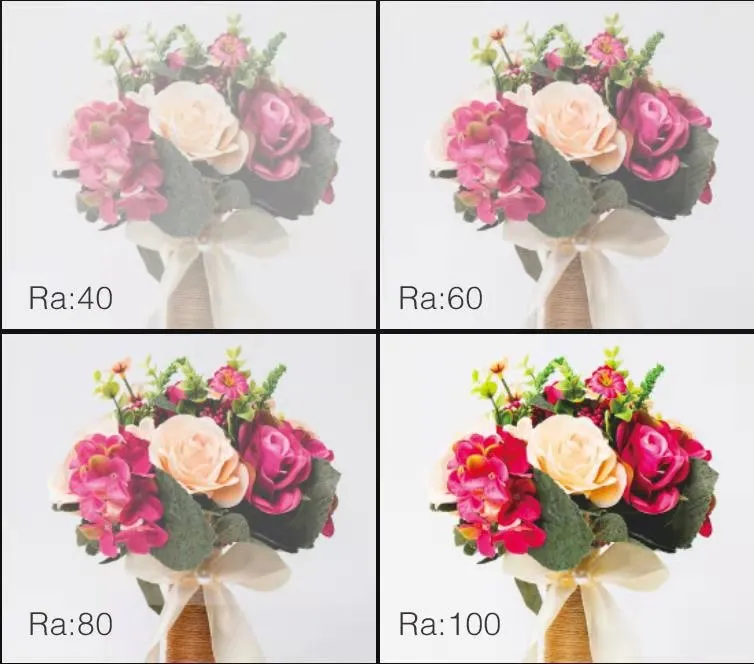
Ra90-100:places requiring precise color contrast, like museum, gallery, etc.
Ra80-90:places requiring correct color judgment, like home furnishing space, dining room, hospital, office, etc.
Ra70-80:large indoor places, like workshop, gym, etc.
Ra<70:outdoor places, traffic roads, etc.
For those special color rendering indices other than R1~R8, for example, R9 stands for saturated red. The higher the R9 index is, the brighter and more real color the mahogany furniture, wine, etc. present. Upon selection and buying of the lights for the dining room, it is suggested paying more attention to R9.

color temperature: color of light
The color temperature (UoM: K) is a physical metric that is used to define the color of a luminaire in the illumination optics. The higher the color temperature of a luminaire is, the more blue the visual effects are. The lower the color temperature is, the more red the visual effects are.
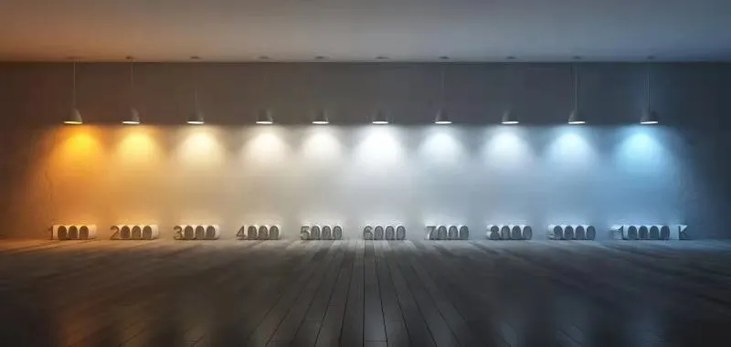
How to select proper color temperature for different spaces and functions?
We cannot define which is better between white and yellow. It mainly depends upon our sight and sense. Generally, it can be distinguished through function and space.
By function:the white light develops more real, with a larger shining contrast, and tending to sunlight, and with a colder color temperature, so it is suitable for working lighting, where the surrounding luminaire is bright and clear, it is inspiring; the yellow light gives a visual warmness due to its color temperature features, with a smaller shining contrast, so it is suitable for building the interpersonal relationship and atmosphere.
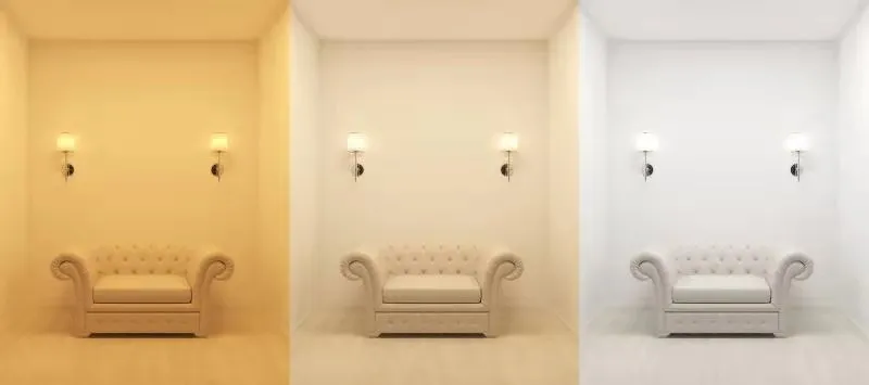
By space:the light color is distinguished by color temperature (frequently between 2700K and 6000K, i.e. from yellow to blue). The light source with a lower color temperature is suitable for bedroom, dining room, and areas for indirect lighting, helping create an atmosphere. The kitchen, working area, desk lamp, and dressing table may adopt such light source with a higher color temperature.